
Choosing or designing landing pages that actually convert visitors into leads remains one of the biggest challenges for digital marketers and web developers. You might have brilliant products or services, but if your landing page fails to capture attention and guide users towards action, your campaigns will underperform. This article examines practical examples of high-performing landing pages, providing clear evaluation criteria and actionable insights to help you boost conversion rates and maximise your marketing investment.
Table of Contents
- How To Evaluate Effective Landing Pages
- Example 1: B2B Professional Services Landing Page
- Example 2: Google Business Profile Optimisation Landing Page
- Comparison Of Landing Pages And When To Choose Each
- Boost Your Landing Pages With Digital Sphere Solutions
- FAQ
Key takeaways
| Point | Details |
|---|---|
| Clear value propositions drive action | Effective landing pages communicate benefits immediately with focused messaging and strong calls to action |
| Visual hierarchy guides user behaviour | Strategic design elements direct attention to conversion points whilst minimising distractions |
| Mobile optimisation is non-negotiable | Responsive designs ensure seamless experiences across all devices, capturing mobile traffic effectively |
| Testing reveals performance insights | Continuous A/B testing and metric analysis help refine landing pages for optimal results |
How to evaluate effective landing pages
Before exploring specific examples, you need a solid framework for assessing what makes a landing page truly effective. Clear value propositions and user-focused design are key to effective landing pages, but several other criteria deserve your attention.
Start by examining clarity. Your landing page should communicate its purpose within three seconds of arrival. Visitors must instantly understand what you offer and why it matters to them. Visual hierarchy plays a crucial role here, using size, colour, and positioning to guide eyes towards critical information and conversion points.
Your call to action deserves special scrutiny. Is it prominent, specific, and compelling? Weak CTAs like “Learn More” rarely perform as well as action-oriented alternatives such as “Get Your Free Audit” or “Start Your 14-Day Trial”. Load speed matters enormously too. Pages taking longer than three seconds to load lose substantial portions of their traffic before visitors even see your content.
Trust elements provide the reassurance hesitant prospects need. Client logos, testimonials, security badges, and case study highlights all contribute to credibility. Mobile responsiveness has shifted from optional to essential, with mobile traffic dominating most sectors.
Common pitfalls to avoid:
- Cluttered layouts overwhelming visitors with excessive information
- Generic messaging failing to address specific pain points
- Hidden or unclear calls to action
- Slow loading times frustrating impatient users
- Forms requesting unnecessary information
Pro Tip: Align every element on your landing page with user intent. If someone arrives searching for pricing information, show pricing prominently. Match content to the source that brought visitors to your page, whether that’s a social ad, email campaign, or search result.
Example 1: B2B professional services landing page
B2B professional services landing pages face unique challenges. You’re typically addressing decision makers who value professionalism, clarity, and efficiency. They want facts, not fluff, and they need confidence that your service delivers measurable results.
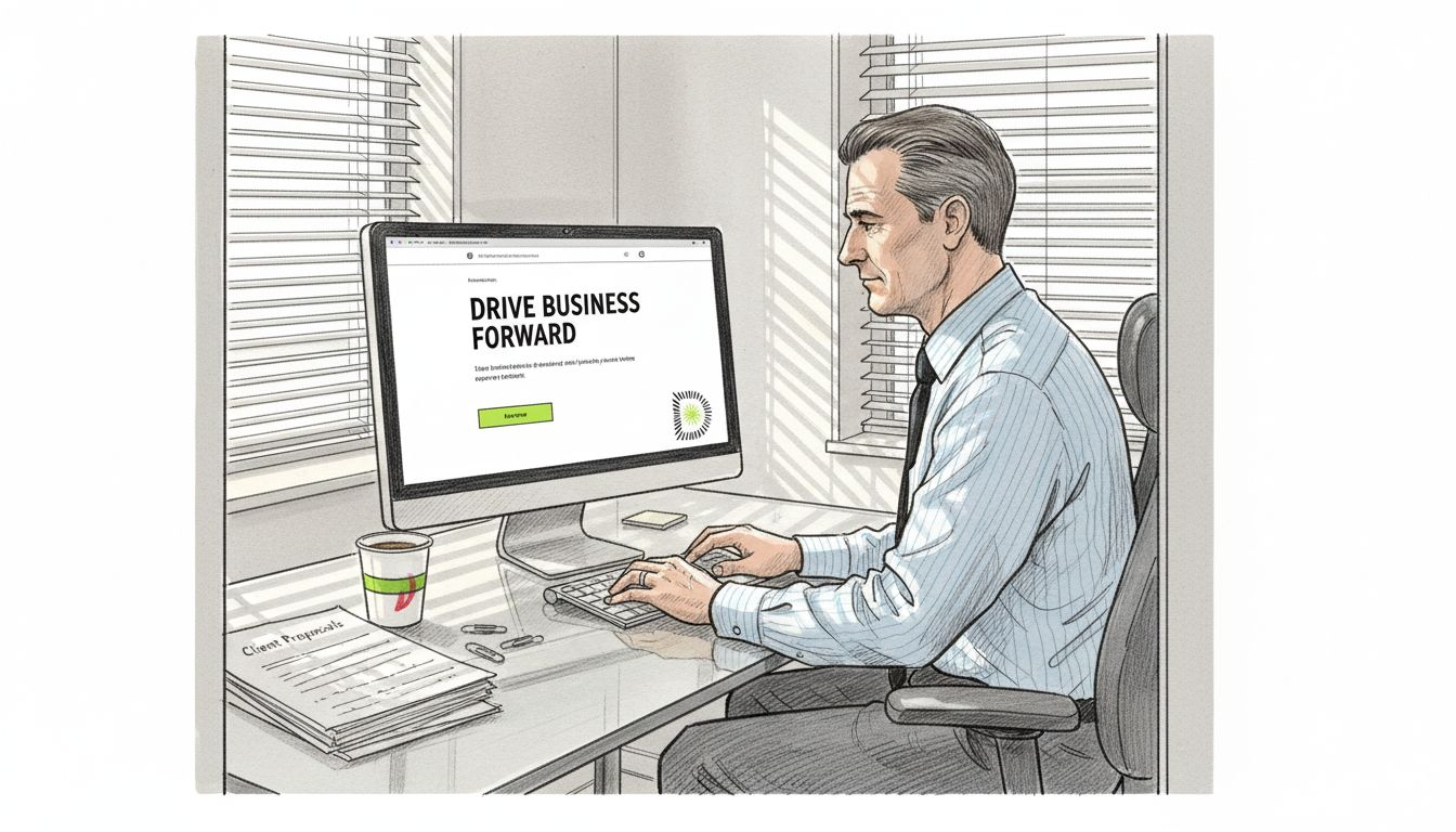
Effective B2B landing pages benefit from clear professional branding and straightforward CTAs. The headline should speak directly to the prospect’s challenge. Instead of “We Provide Excellent Marketing Services”, try “Reduce Customer Acquisition Costs by 40% in 90 Days”. Specificity builds credibility.
Benefit statements work best when they’re concise and results-focused. SME decision makers scan rather than read, so bullet points highlighting key advantages perform better than dense paragraphs. Each point should answer the implicit question: “What’s in this for my business?”
The call to action for B2B services often centres on consultation requests rather than immediate purchases. “Request a Consultation” or “Schedule Your Strategy Call” feels appropriate for high-consideration services. Position this CTA prominently above the fold and repeat it strategically throughout longer pages.
Trust signals matter enormously in B2B contexts. Client logos from recognisable brands provide social proof. Brief testimonials with names, photos, and company details add authenticity. Case study snippets showing concrete results build confidence.
Key features of effective B2B landing pages:
- Professional design reflecting industry standards
- Clear headline addressing specific business challenges
- Benefit-focused copy with measurable outcomes
- Strategic placement of consultation CTAs
- Trust elements including client logos and testimonials
- Clean layout minimising distractions from conversion path
The layout should guide visitors naturally from problem recognition through solution understanding to action. Each section builds on the previous one, creating a logical flow that feels conversational rather than pushy.
Example 2: Google Business Profile optimisation landing page
Local optimisation landing pages serve a specific niche but demonstrate principles applicable across sectors. These pages target SMEs seeking to improve their local search visibility and attract nearby customers.
Optimised Google Business Profile landing pages can significantly enhance local SME visibility and leads. The approach differs from broader B2B pages because the audience has already identified their problem. They know they need better local search presence. Your job is showing them you’re the solution.
Keyword alignment matters here. If prospects search for “Google Business Profile optimisation”, your headline should echo that language. Don’t get creative with synonyms. Match their search intent precisely to signal relevance immediately.
Minimalist design works exceptionally well for these focused landing pages. You’re not selling complex enterprise software requiring extensive explanation. You’re offering a specific service with clear benefits. A simple layout with prominent CTA reduces friction and speeds decisions.
The pain point approach resonates strongly. Highlight what SMEs lose without proper optimisation: missed local searches, customers finding competitors instead, inaccurate business information damaging reputation. Create urgency by quantifying these losses where possible.
Your CTA might offer a free audit, downloadable guide, or direct consultation booking. The key is removing barriers to that first step. If you’re promoting an ebook, make the download process frictionless. One form field beats five every time.
Effective elements for niche service landing pages:
- Keyword-aligned headlines matching search intent
- Simplified design focusing attention on core message
- Pain point emphasis showing cost of inaction
- Low-barrier CTAs like free resources or audits
- Local relevance in imagery and examples
Pro Tip: Incorporate social proof strategically throughout the page. Before and after screenshots showing improved search rankings, brief testimonials from local businesses, or specific metrics like “Helped 200+ SMEs improve local visibility” all strengthen your case without overwhelming visitors.
Comparison of landing pages and when to choose each
Understanding when to deploy different landing page approaches helps you match design to objectives. Different landing page designs perform better based on specific marketing objectives and audiences.
| Feature | B2B Professional Services | Local Optimisation Niche |
| — | — |
| Primary goal | Generate qualified consultation leads | Drive ebook downloads or audit requests |
| Target audience | Business decision makers and managers | Local SME owners seeking visibility |
| Layout complexity | Moderate with multiple trust elements | Minimal with focused single message |
| CTA style | Consultation or strategy call booking | Free resource download or quick audit |
| Content depth | Detailed benefits and case evidence | Concise pain points and quick solutions |
| Trust signals | Client logos, testimonials, credentials | Reviews, local results, simple metrics |
The B2B professional services approach suits complex offerings requiring consideration and relationship building. If your service involves significant investment or ongoing commitment, this format provides space to build confidence and address objections. It works well for agencies, consultancies, and professional service providers targeting mid-market or enterprise clients.
The niche optimisation approach excels when you’re targeting a specific, well-defined problem with a clear solution. These landing pages convert quickly because prospects arrive with high intent. They work brilliantly for specialised services, specific tools, or focused educational resources.
Your choice depends on several factors. Consider your business type first. Are you positioning as a comprehensive partner or a specialist solving one problem? Campaign goals matter too. Lead generation campaigns might favour the consultation approach, whilst awareness campaigns could benefit from resource-focused pages.
Budget influences decisions as well. Simpler landing pages cost less to design and test. If you’re running multiple campaigns with limited resources, focused niche pages might stretch your budget further. However, if you’re targeting high-value clients, investing in comprehensive B2B pages pays dividends.
Don’t treat this as a permanent decision. The beauty of digital marketing lies in testing and refinement. Start with the approach matching your immediate goals, then test variations. Monitor conversion rates, bounce rates, and user behaviour. Let data guide your evolution towards optimal performance.
Boost your landing pages with Digital Sphere solutions
Creating landing pages that convert requires expertise across design, copywriting, and technical optimisation. Digital Sphere brings all these elements together, helping businesses like yours maximise every marketing pound invested. Our team specialises in building landing pages that don’t just look professional but deliver measurable results.
We’ve helped hundreds of businesses transform their online presence through strategic digital solutions. Whether you need a complete landing page overhaul or want to optimise existing pages, our approach combines data-driven insights with creative excellence. Explore our comprehensive digital solutions to see how we can support your growth.
Looking to deepen your digital marketing knowledge? Download our free marketing ebook packed with actionable strategies for improving your online performance. Once you’re working with us, access everything you need through our intuitive customer dashboard, where you can track projects, review analytics, and communicate with your dedicated project manager. Let’s turn your landing pages into conversion machines.
FAQ
What makes a landing page effective?
Effectiveness stems from several interconnected elements working together. Clarity ensures visitors immediately understand your offer and its relevance to their needs. A persuasive call to action guides them towards the desired conversion, whether that’s a purchase, signup, or consultation request. Fast load times prevent frustration and abandonment, whilst trust elements like testimonials and security badges reassure hesitant prospects. Align every aspect of your landing page tightly with user intent for optimal results.
How can I test my landing page performance?
A/B testing tools allow you to compare different page variants systematically. Test one element at a time, such as headlines, CTA buttons, or form lengths, to isolate what drives improvement. Monitor key metrics including conversion rates, bounce rates, time on page, and user engagement patterns. Most testing platforms require several hundred visitors per variant to reach statistical significance, so be patient. Small incremental improvements compound over time into substantial performance gains.
Should I focus on mobile optimisation for landing pages?
Absolutely. Mobile traffic now dominates most sectors, with over 60% of web visits coming from smartphones and tablets. If your landing page doesn’t function flawlessly on mobile devices, you’re losing more than half your potential conversions. Responsive designs automatically adapt to different screen sizes, ensuring buttons remain tappable, text stays readable, and forms work smoothly. Mobile optimisation isn’t optional anymore. It’s the baseline expectation for professional digital presence.
What are common mistakes to avoid on landing pages?
Overloading pages with excessive information overwhelms visitors and dilutes your core message. Keep content focused on one primary goal. Weak or unclear calls to action leave visitors unsure what to do next. Make your CTA prominent, specific, and action-oriented. Ignoring page load speed frustrates users and tanks your conversion rates. Compress images, minimise code, and use reliable hosting. Finally, neglecting mobile responsiveness alienates the majority of your traffic. Test your landing page thoroughly across devices before launching campaigns.